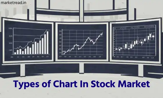
Types of Chart - Most used stock charts
Before understanding the different types of charts and their importance, did you know that technical analysis is also an important tool for analyzing the stock market?
You can read my other article about technical analysis, here we understand in brief that the main use of technical analysis is to study the past price movements of a stock or security and predict the price trend in the future.
This study includes indicator and volume data. Here everyone's method of technical analysis may be different. But basically, it helps us predict future price movements. And that is why charts play a very important role in technical analysis. With the help of charts, we can easily predict future price movements by looking at past price movements.
There are different types of charts used to understand the price movement in the stock market. Stock charts help us understand the fluctuations in the price of a security. However, with the variety of charts available, it is important to understand which one best suits your needs.
Line Charts
The simplest and most common one you'll see around. That's a line chart! It tracks a stock's closing prices over time. Think of the y-axis as a price ladder, and the x-axis as a timeline. By plotting these closing prices and connecting them with a line, you get a clear picture of how the stock's price has moved overall.
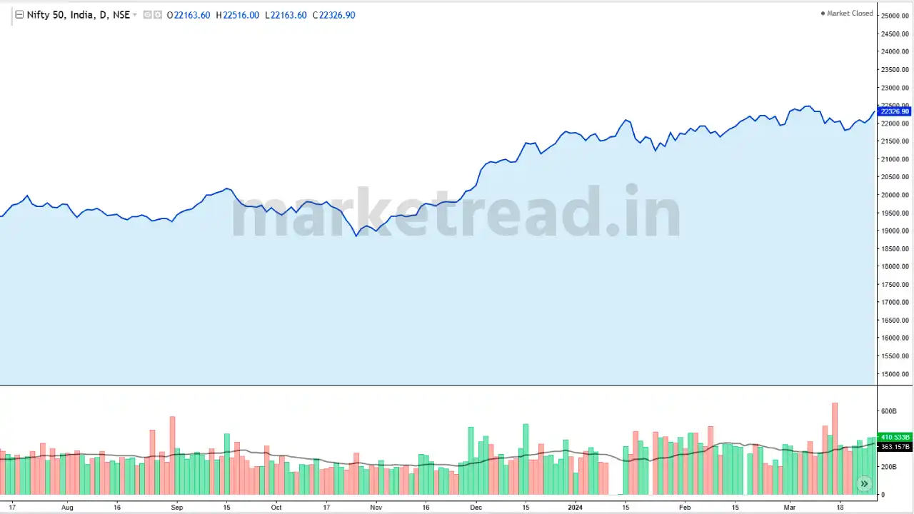
This type of chart is great for long-term investors. They help us understand the big picture – is the stock generally going up, down, or just bouncing around? They keep things simple and show the overall trend.
However, there's a catch. Line charts only show the closing price, not the daily ups and downs. So, if you're a quick in-and-out trader, a line chart might not be enough information for you to make those speedy decisions.
Bar Chart
Imagine you're looking at a stock's price movement, but instead of just a line, you see bars. These bars, also called OHLC charts (because they show the Open, High, Low, and Close prices), give you a much clearer picture of what's happening.
Each bar represents a specific period (The time frame you choose), like a day or a week. The body of the bar shows the difference between the opening and closing prices. If the closing price is higher, the bar is usually filled in, and if it's lower, the bar is often hollow.
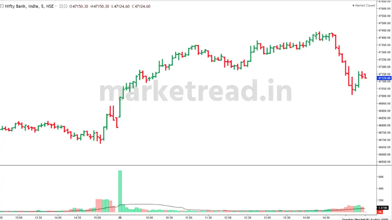
The top and bottom lines of the bar tell you the highest and lowest prices the stock reached during that time. A long bar means the price swung up and down a lot (volatile), while a short bar means it stayed pretty steady.
These charts are great for day traders who need to see everything happening quickly. They can easily spot areas where the price seems to struggle to go higher (resistance) or lower (support).
The downside? They can be a lot to take in at first, with all that info packed into one bar. But once you get used to reading them, bar charts can be a super powerful tool for understanding the stock market.
Candlestick Chart
You might have often seen the traders using candlestick charts. A Candlestick chart is a cool and simple way to see how a stock's price has moved over time, especially for beginners. They were actually invented in Japan, hence it is also called the Japanese Candlestick Chart!
Think of them like a Bar chart but with more details. They show the opening price, the highest price it reached, the lowest price it dipped to, and the closing price – all for a specific period, like a day or a week.
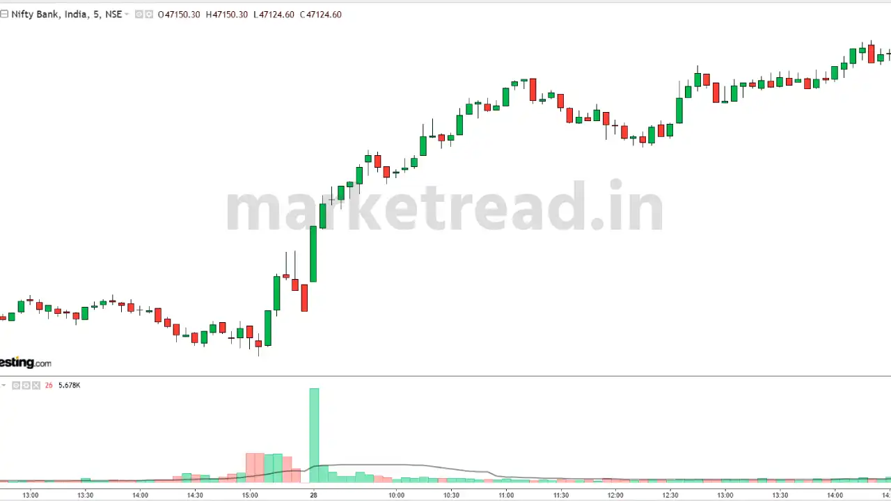
The neat part is how they look. Each candlestick has a body and maybe some lines (shadows or wicks) sticking out of it. A filled-in body means the price closed lower than it opened, with the top showing the opening price and the bottom showing the closing price. If the body is hollow, then the opposite is true – the price closed higher than it opened.
The shadows tell you how high and low the price went during that time. A long shadow means the price swung way up or way down compared to the opening and closing prices. The colour of the body (usually black or white, but some charts use green and red) can also be a clue. Black or red generally means the price went down, while white or green suggests it went up.
These candlestick charts are super helpful for traders because they can show patterns in price movements. These patterns might be hard to see on a regular bar chart. Traders use these patterns, like the "doji" or "hammer," to decide when to buy or sell a stock.
Conclusion
Understanding the different charts is a key skill for any investor or trader. There are three main types to be familiar with:
- Line charts: These are great for seeing the big picture, like the overall trend of a stock's price movement over time.
- Bar charts: If you want more details, like the range a stock's price moved within each day, then bar charts are your friend. They also tend to show you the closing price more clearly.
- Candlestick charts: These are popular with technical analysts because they combine the price range of bar charts with the opening and closing prices in a way that's easy to see. This extra detail can help you spot patterns in the price movement.
No matter how long you plan to hold stocks, being familiar with all these chart types can help you make better decisions by giving you a more complete picture of what's happening in the market.
FAQs
What type of chart is used in the stock market?
Line charts are great for long-term investors. Day traders and swing traders prefer Bar charts and candlestick charts because they capture more information within each bar or candlestick.
What are the 4 types of stock charts?
Bar charts, Candlestick charts, Line charts, and Point and figure charts.